Studies
Exclusion of Angles
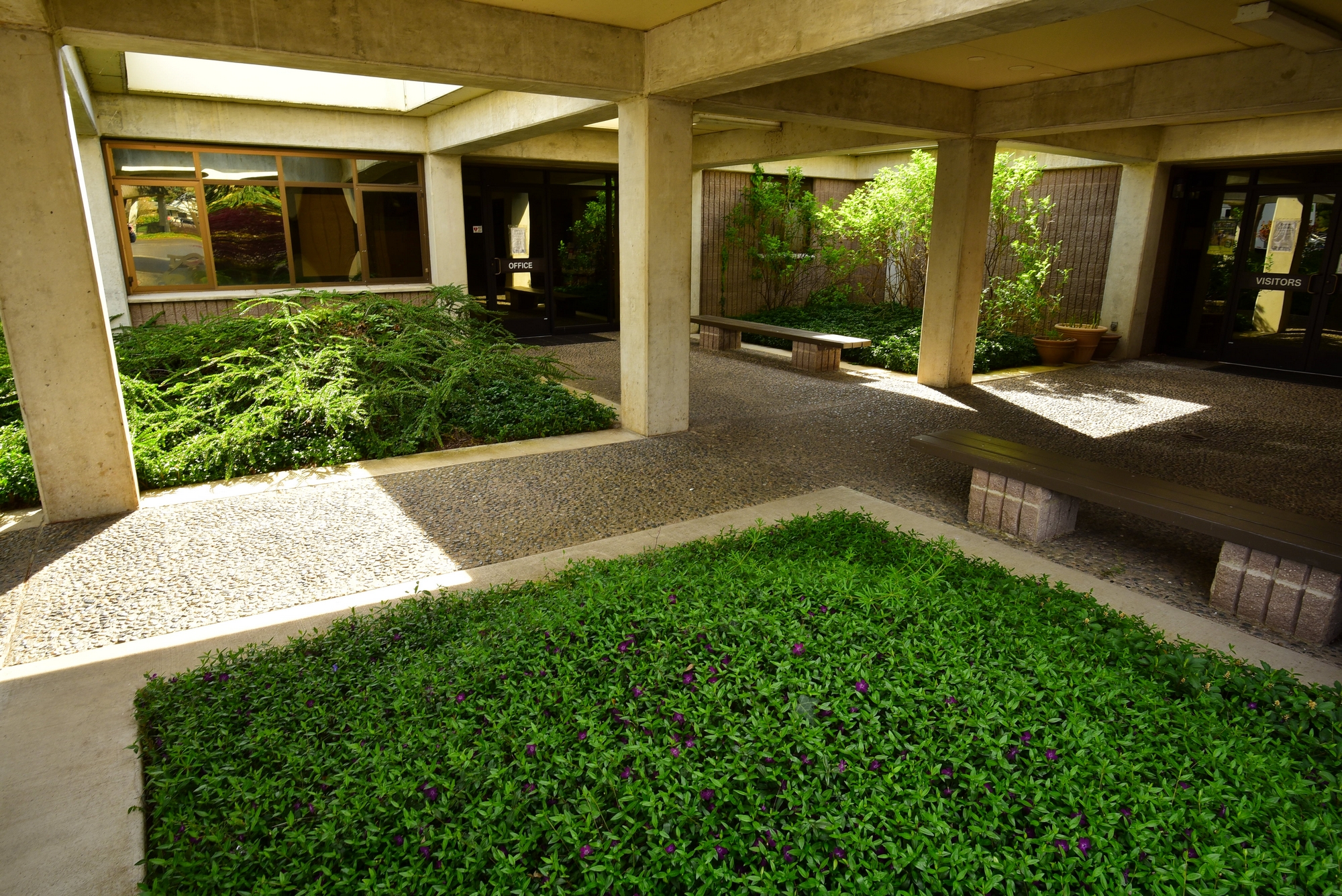
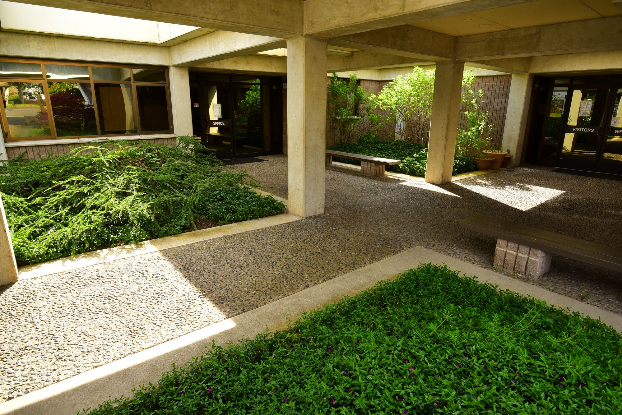
I was doing some basic line studies on the architecture of this visitor center because I like the design. I noticed the angle of lines at the bottom left of the “Subject #1” photo seemed to mess with the visual appeal. It’s too noticeable and draws the eye into that corner rather than allowing it to wander the rest of the photo. So I shifted my position a slight amount in order to push it out of the frame. “Subject #2” in my opinion seems much cleaner in this respect. There are still other issues but this seemed to help it tremendously.
Please consider sharing to one of the following social media outlets:

