Studies
Composition Challenges
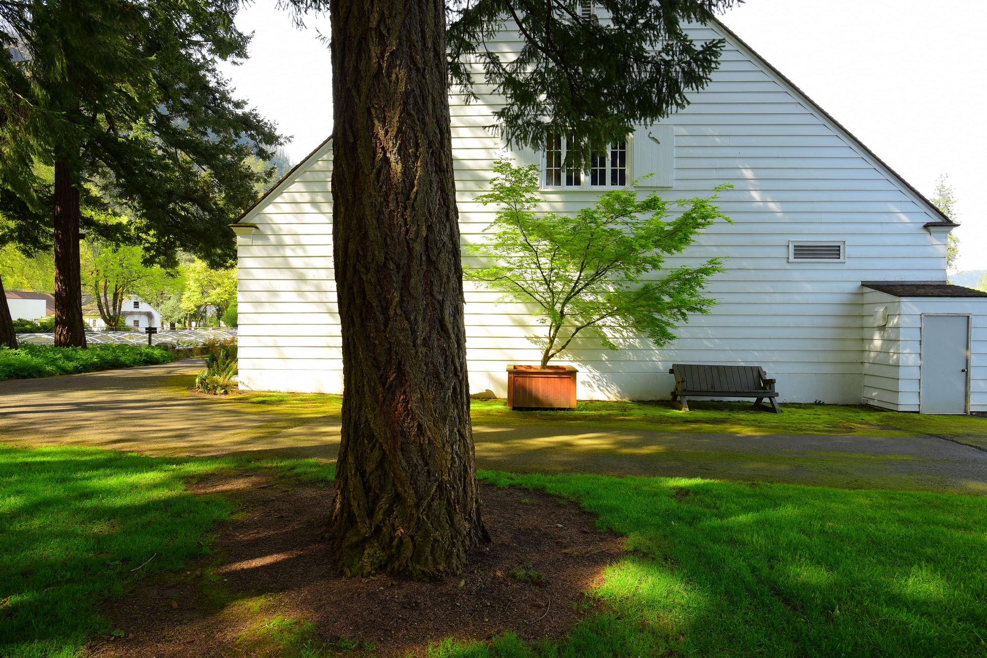
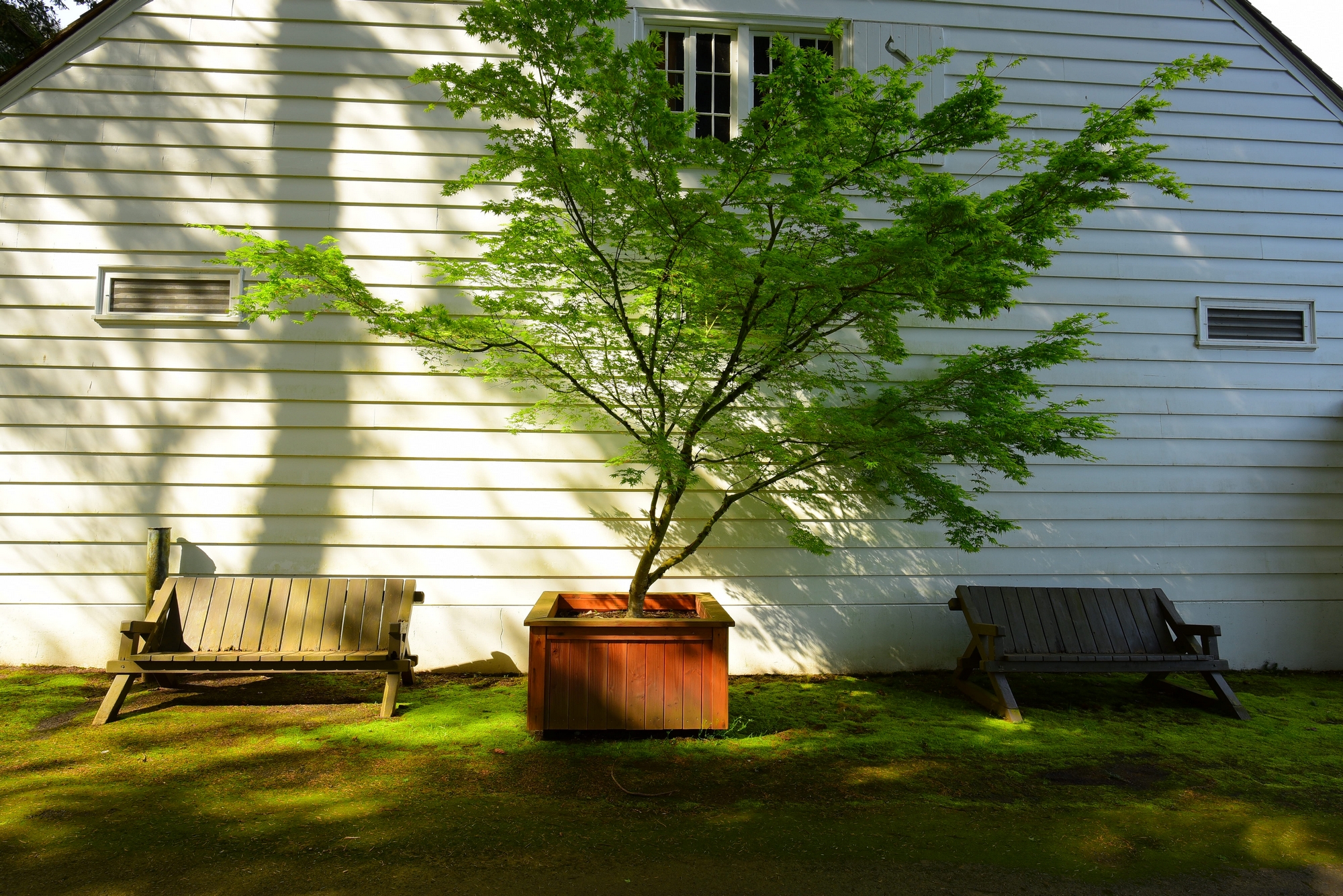
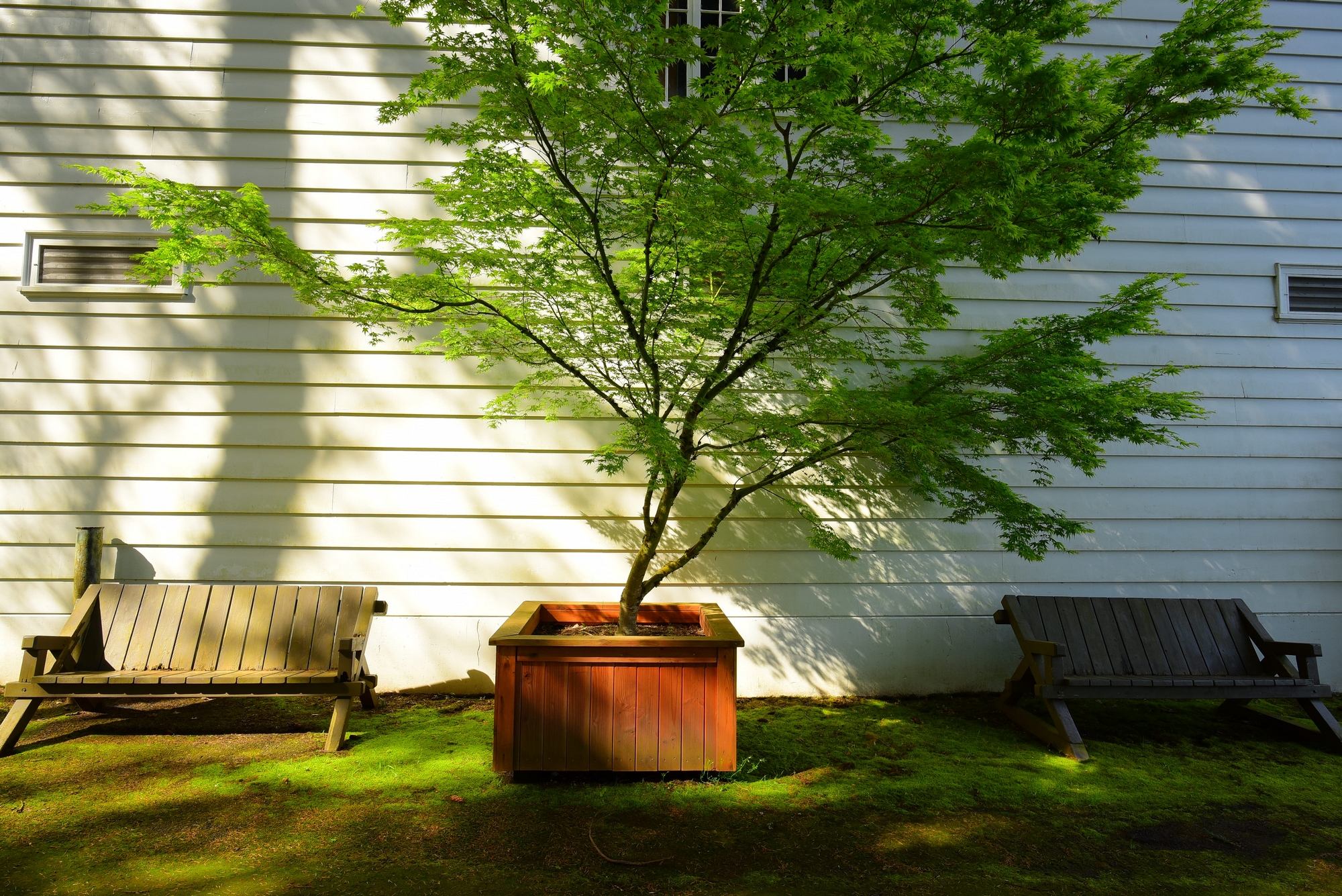
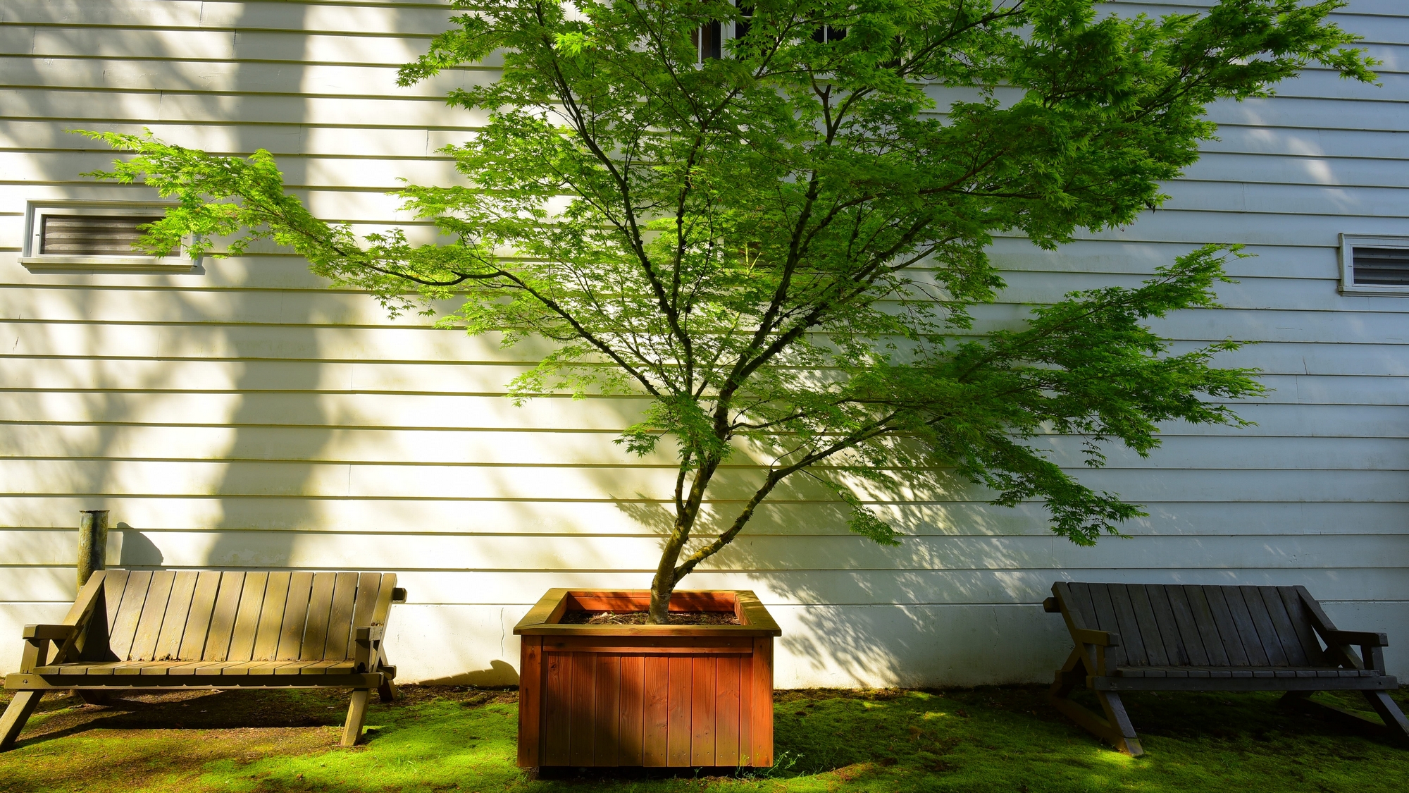
Sometimes you love what you see but just can’t get the composition right. Each of these photos has it’s strengths and each has it’s faults. On “Subject #1” I wanted to include as much of the building as possible which meant I had to include the tree trunk somehow but also try to eliminate some less desirable elements on the right side. Too close and the trunk would swamp the photo. Placing the trunk at the left corner of the building I felt created an incomplete emotion. I opted to cover one of the benches with the tree. I was able to get the potted tree in the center but this created an out-of-center perspective. There are other issues I will not go into. So now with “Subject #2” and “Subject #3”, I wanted to get a nice shot of the two benches and the potted tree and try to enhance the angled shadow lines that drew me in to begin with. This now incorporated a new predicament between the roof slopes on either side and the potted tree. Which is better? Well that’s a toss up. The slopes at each of the upper corners in “Subject #2” tends to draw the eye away from the subject which is the tree, but I get a fuller feeling because I’m not cutting off the top of the tree. In “Subject #3” I’ve eliminated the roof slopes but had to sacrifice some of the upper portions of the tree. All of these photos are good but each one has composition issues. Choosing between them I would select “Subject #3”. But not sure that I would use it in a print. Maybe cropping off some of the walkway in the foreground at the bottom of the photo and creating a little more of a pano view as in “Subject #4” might help.
Please consider sharing to one of the following social media outlets:


